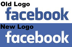
Facebook makes minor changes to logo
02 Jul 2015
The last time Facebook made a minor change to a part of its widely-used website, most users failed to spot the difference in the first go.
The social networking giant had made a change in its main wordmark logo, this year, which too is likely to go unnoticed by billions of daily users easily.
There has only been a slight change in the new Facebook wordmark, and while the font remains nearly the same as the old one, there are several minor changes.
The changes only become apparent when the two logos are overlaid on each other. The overall size of the new logo has now shrunk marginally and the letters are slightly slimmer than before in the new typeface. Also, the gaps inside the letters 'a', 'e', 'b', and 'o' had now been made more circular. Also the letter 'a' had been completely overhauled in the new Facebook logo.
Facebook product designer Christophe Tauziet yesterday revealed the new Facebook brand logo on Twitter.
The logo had been created by the company's in-house design team in collaboration with Eric Olson, a popular typeface designer whose typeface Klavika had been used in the original wordmark.
The design however, has still not been been rolled out everywhere, the original wordmark was still seen on Facebook's login and logout page.
Logo blog Brand New reported creative director Josh Higgins as saying the point of the update was to "modernise" the logo and make it feel more friendly and approachable''.
According to commentators, the latest logo makeover could easily be seen as the next step in Facebook's efforts to prune its visual identity.
According to Olson the brief for this was to be a little more friendly and more approachable.
He added designing for accessibility was a matter of paring down the letters.
"The thing that I really wanted to bring over to the new one was a single story 'a'. I felt like there was a point of entry there to streamline a bit," Olson added.
That change to one letter made the entire logo friendlier by conveying a sense of conviviality or rather the logo had become simpler.


